Kinfolk: A Publication Analysis
Publication Design | Website Design | UI Design
Cocreated a publication analysis of Kinfolk Magazine. The goal of this project was to examine a publication’s visual language system and learn how content informs layout design. Analyzed both the print publication and online website, and created an online interactive website displaying research findings.
︎ Link︎ Interactive website walkthrough
Co-created with Molly Mills
Fall 2020

Analysis / Grid System
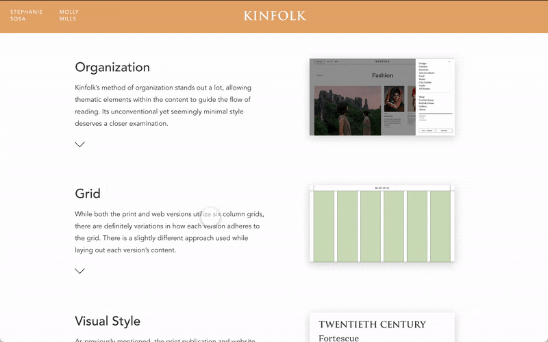
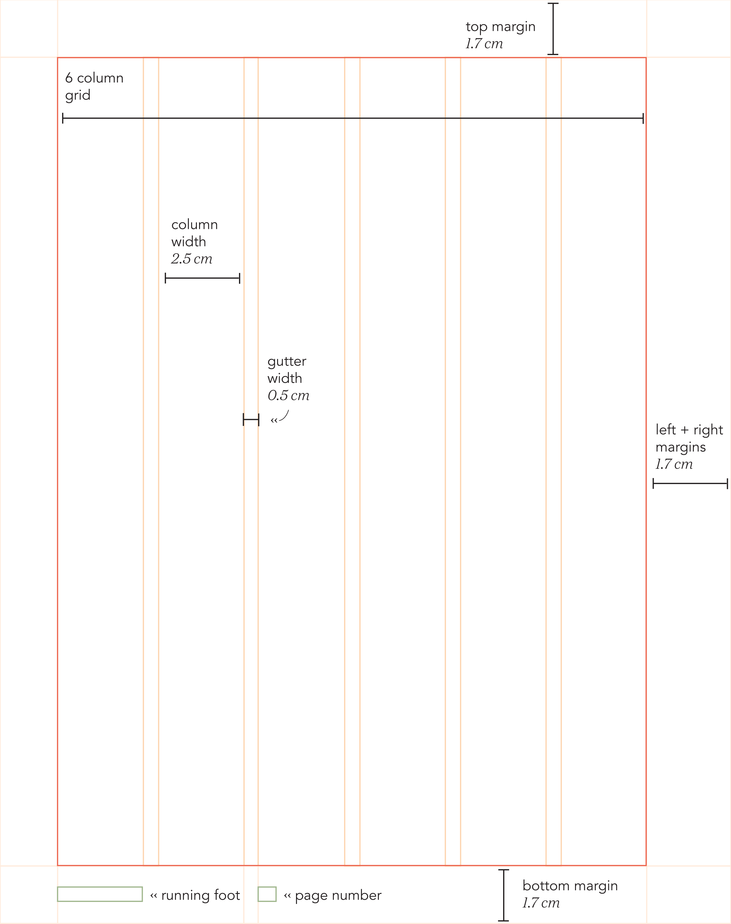
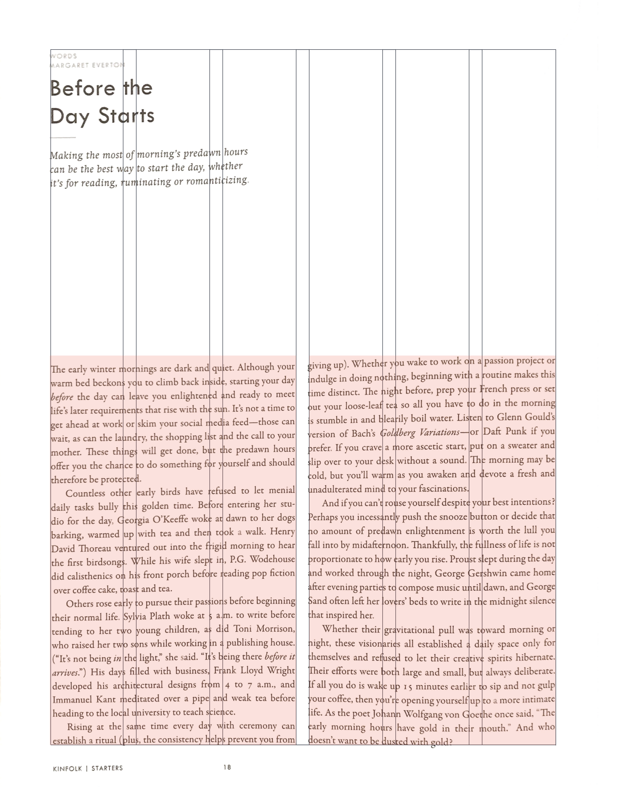
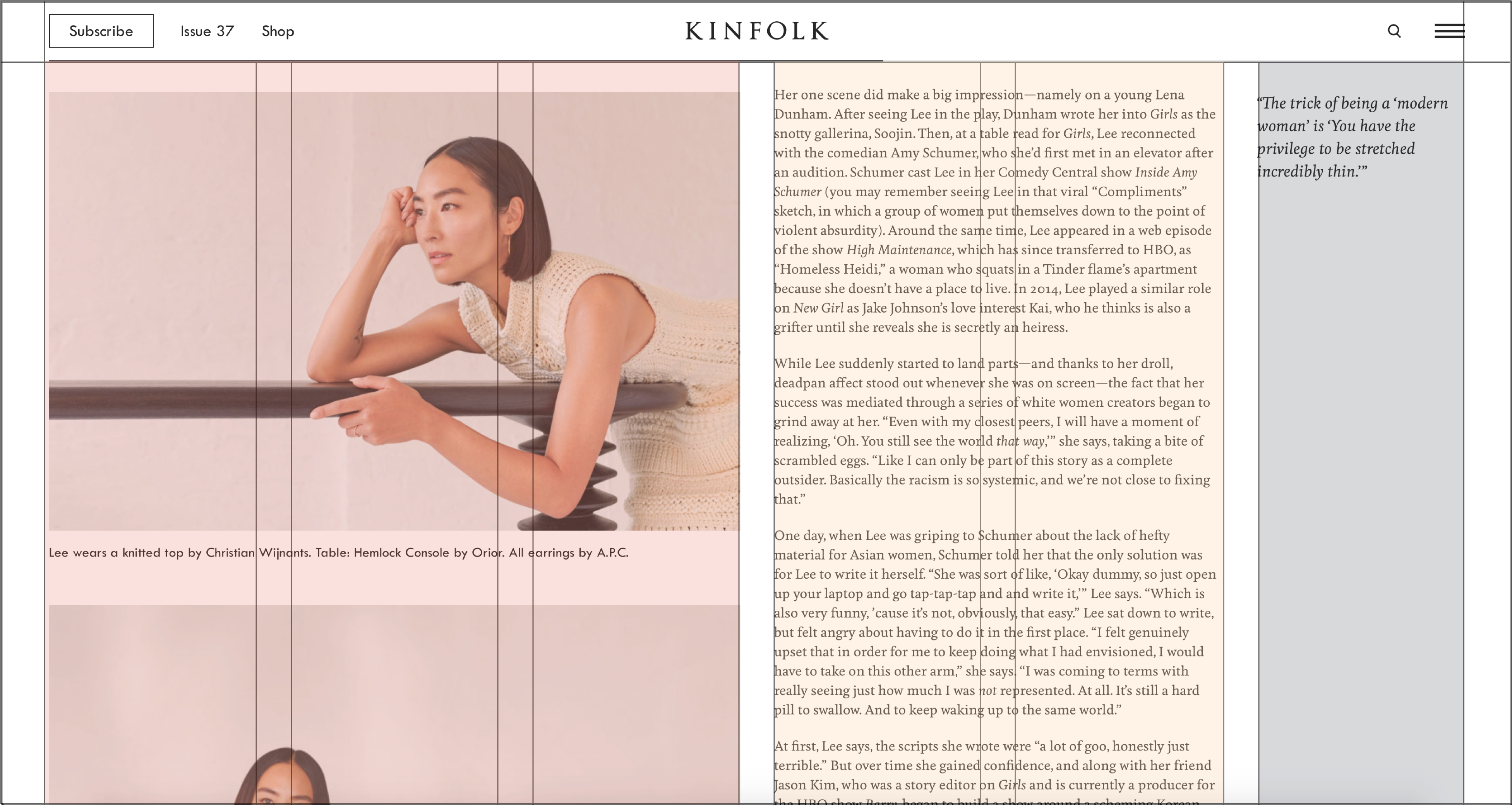
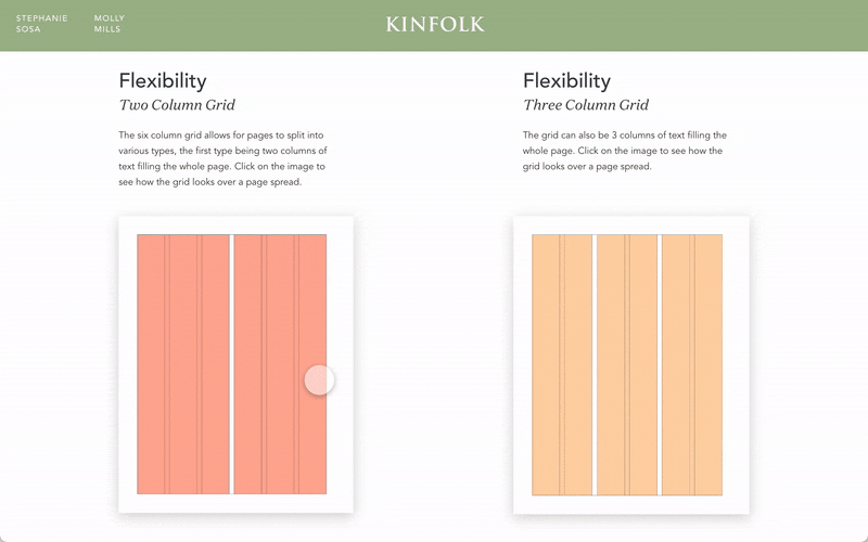
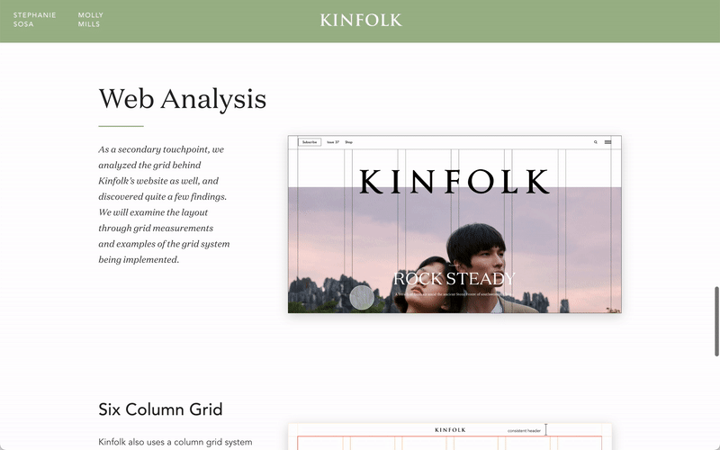
Kinfolk’s grid system is made of 6 columns, and is used to maintain a very consistently, clean layout through both print and web publications. Both text and image occupy spatial zones in blocked out styles. The consistency of adhering to the grid contributes a minimalistic feel to the publication, letting the grid take control.
Kinfolk uses a six column grid system to guide its layout.
Analysis / Grid System
Kinfolk’s grid system is made of 6 columns, and is used to maintain a very consistently, clean layout through both print and web publications. Both text and image occupy spatial zones in blocked out styles. The consistency of adhering to the grid contributes a minimalistic feel to the publication, letting the grid take control.
Kinfolk’s grid system is made of 6 columns, and is used to maintain a very consistently, clean layout through both print and web publications. Both text and image occupy spatial zones in blocked out styles. The consistency of adhering to the grid contributes a minimalistic feel to the publication, letting the grid take control.
Kinfolk uses a six column grid system to guide its layout.
Print Publication

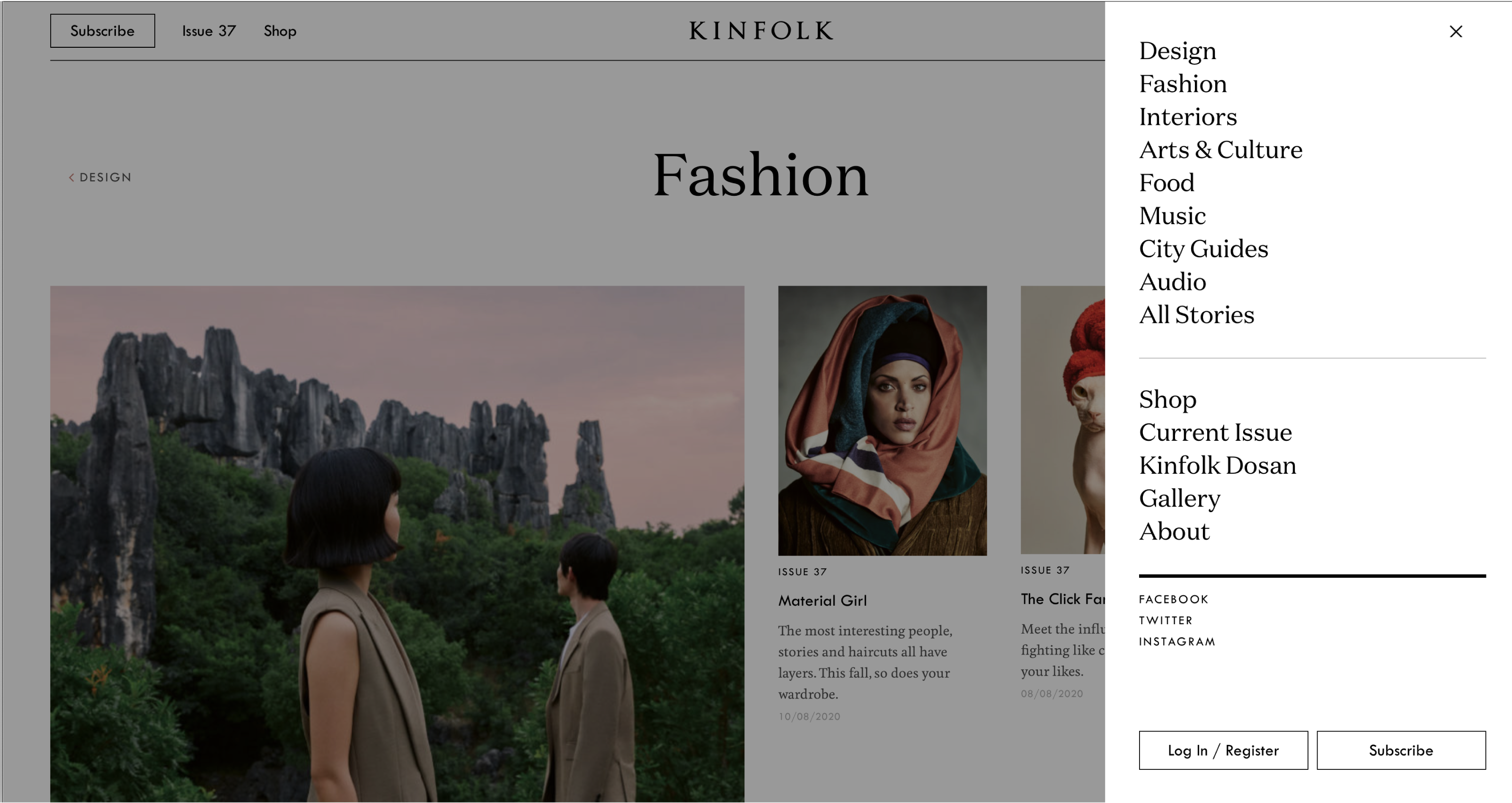
Website


Analysis / Content Organization
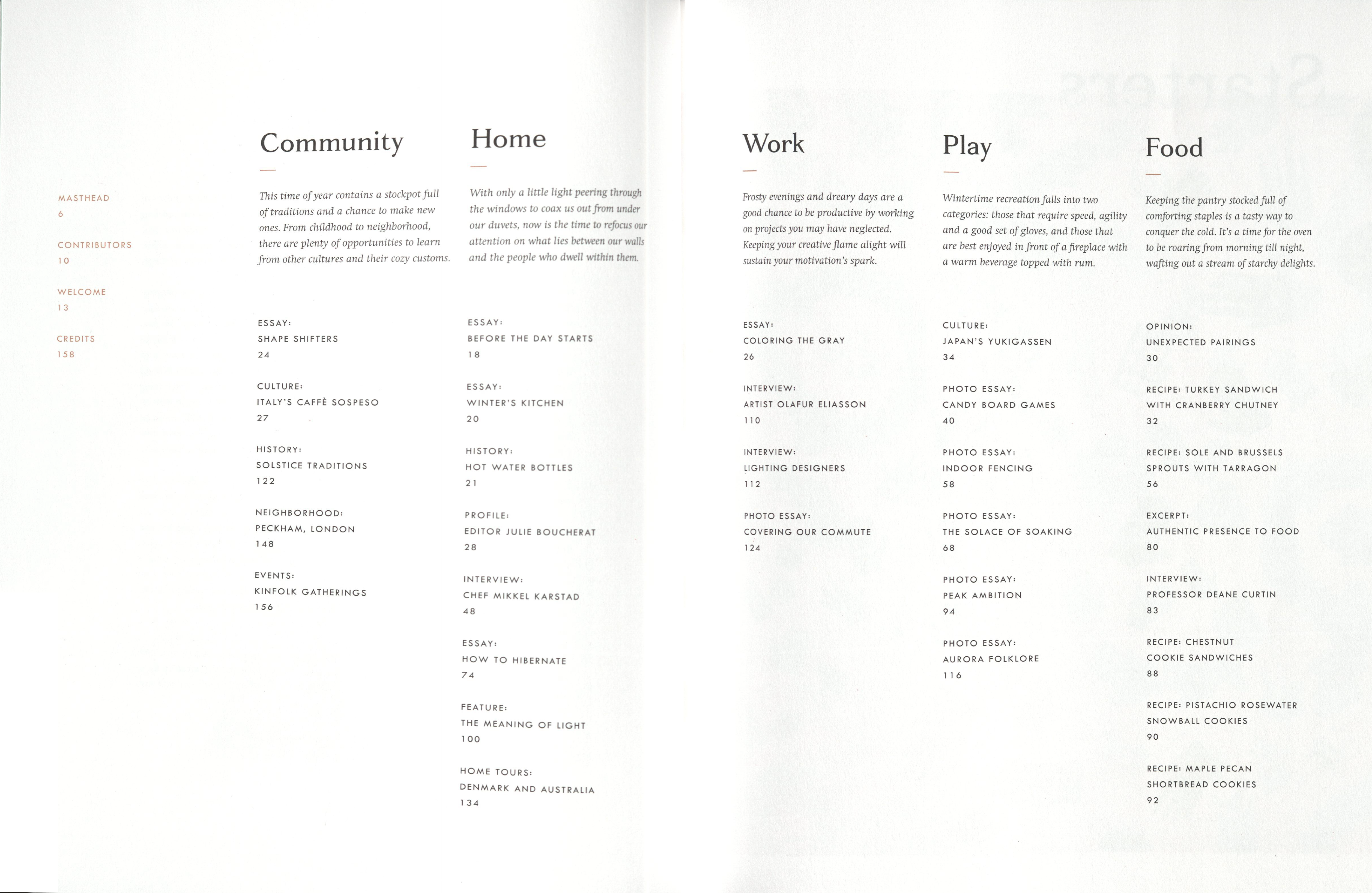
Both the web platform and the print publication organize their content into sections based on subject. Kinfolk uses these sections as a way for readers to quickly navigate to sections of interest with its nonlinear flow.
Instead of being organized chronologically by subject, content in the publication is scattered throughout the book in order to tell a broader story by connecting smaller narratives with interconnected themes.
Interactive Website
We put all these research findings into this communication tool: an interactive website. Click the link below to view the full walkthrough.
︎ Link > Interactive website walkthrough
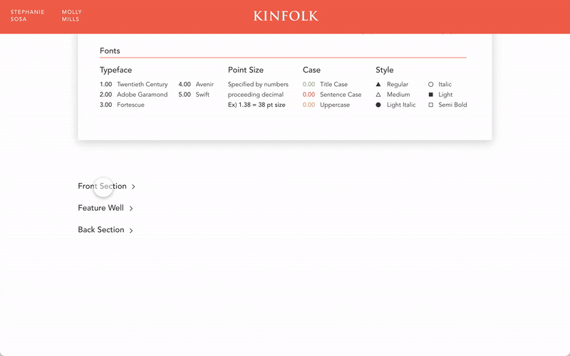
Grid Analysis
Taxonomic Chart

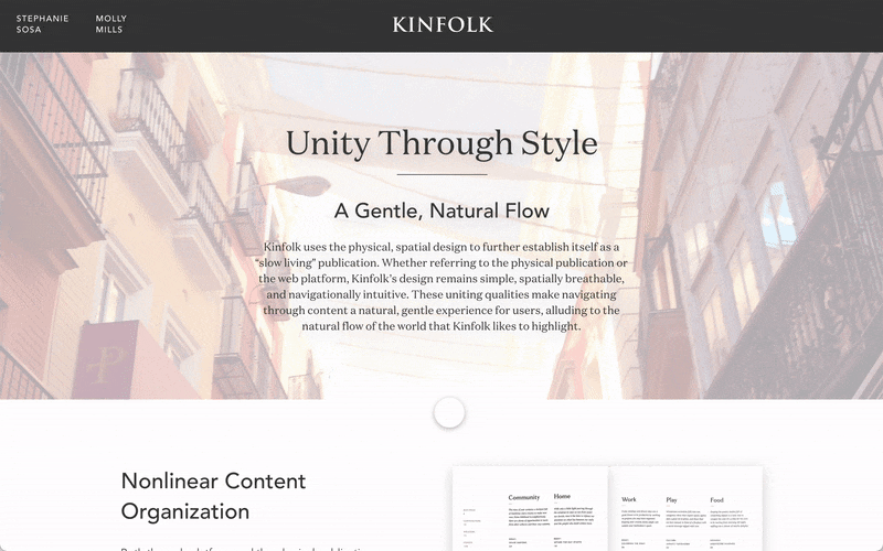
Unity Through Style // Compare & Constrast